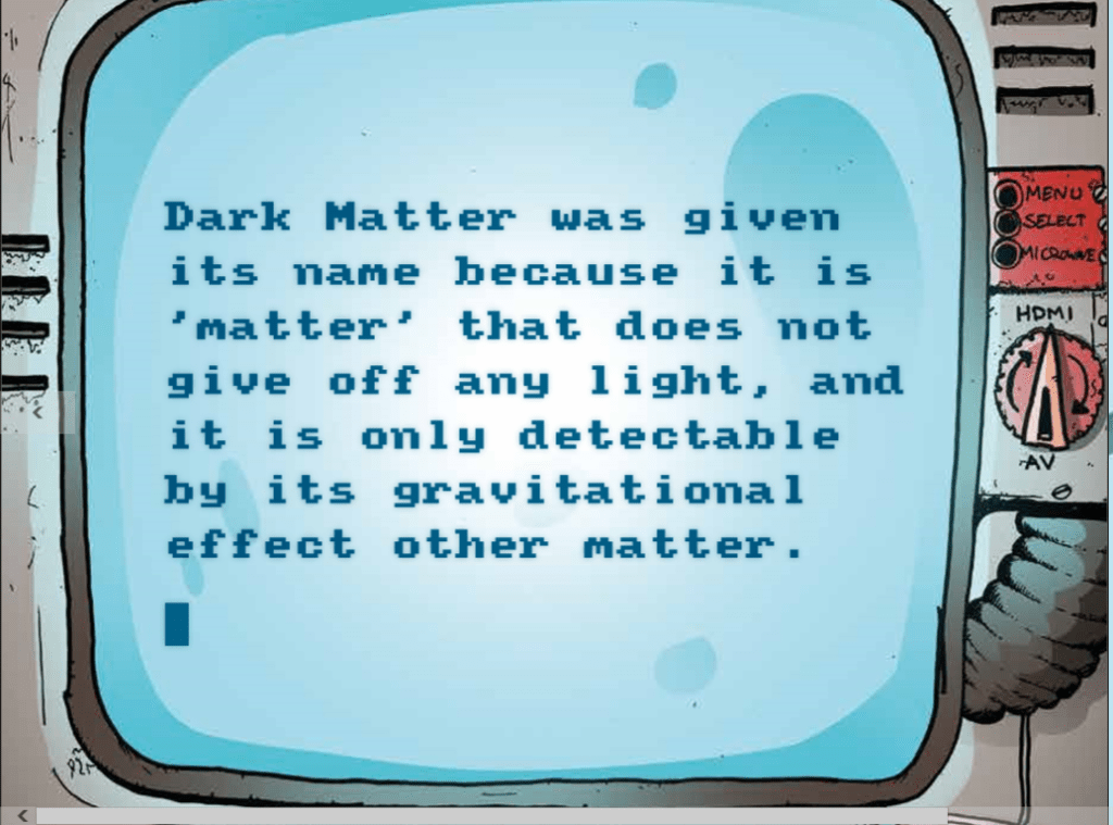
And WE Are BACK with one of the wildest cyberpunk sagas in comics in modern times, Complete Darkness, and this time we are surprised by a side story, still about dark matter and the apocalypse, to which this whole saga revolves around.
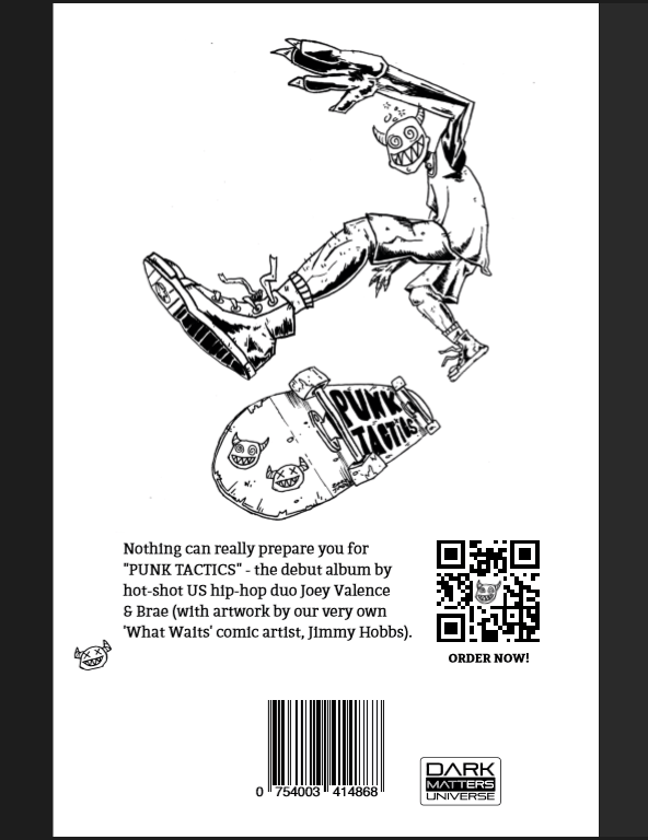
We have not one but TWO new artists on this, before we tell you how amazing a job they did with “What Waits For Us In The Dark (Matter)” , we must invite you to read, and get your copies of the previous books and comics! Don’t worry, we reviewed them all (click here for reviews), and talked about them with the author, the one and only, Matt Adcock in our interviews with him (click here to see them), so enjoy and join the party.

If you are one of the gang, and are following this crazy, brutal, apocalyptic cyberpunk saga of comics and the award-winning novel, then you will have no trouble understanding what are we going to say here, but for those who are reading for the first time, we will do our best to keep it understandable for you as well, so carry on reading this review.

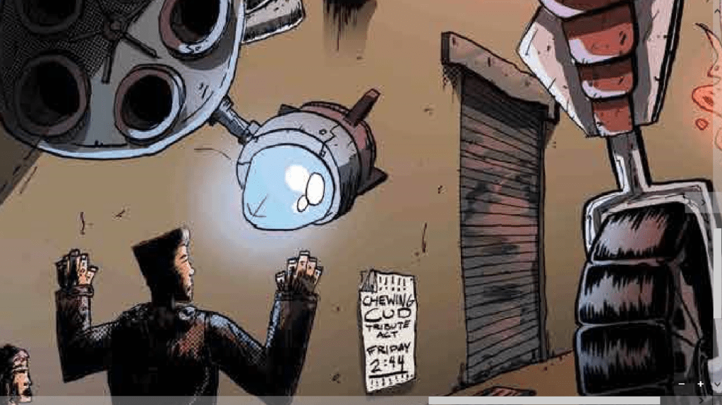
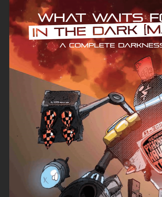
The graphics are DIRTY! (That’s a good thing). And we love it! It stays true to the Complete Darkness series, the whole atmosphere of London2, the city where this whole saga takes place, and given that this is the first time we have a full coloured comic, it matches our expectations of the scenarios where our characters would walk around.
We got to say that the pallets used here were well picked up. You have the shades of brown and orange with a front position, the always present black, the dull grey that sets the tone of the mood of that city that was a great touch by the artist Aline Martins. That being said, the cover makes a great impression for fans of the series like us.

Now, people are looking at these images and saying: “What is this so special about? I’ve seen better graphics in comics”, and we understand why one would say that. Yet, one has to remember that The Complete Darkness comics are hand-made. That’s right, this was hand-made my friends, and to see the consistency of graphics this good, by a young artist, on his FIRST comic, EVER, with the level of details that we have here, THAT, is respectable, hands-down, just look at these shots:
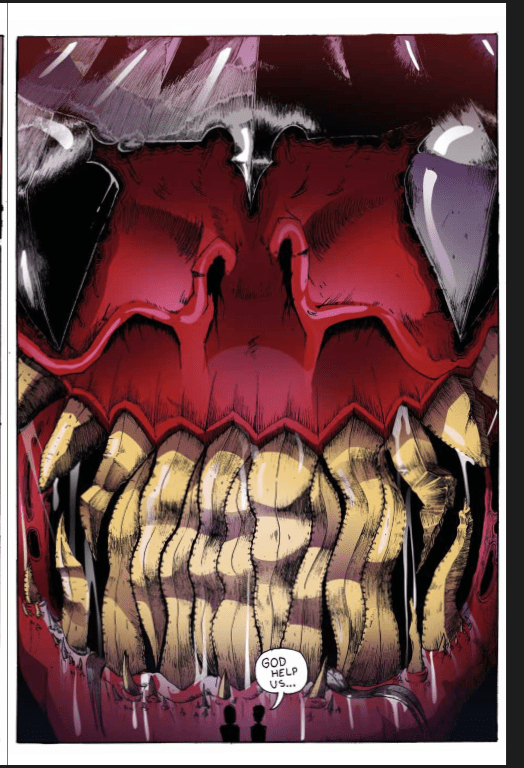
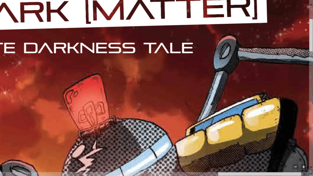
The art by Jimmy Hobbs, and the colouring of Aline Martins is something to stare at. This is beautiful, and we are only talking about the cover, mind you. Like, look at these!
The color tone overlaps to enhance the brightness, the light hues created by thick glass, the light dispersion and the creation of shadows. THIS IS AMAZING WORK!
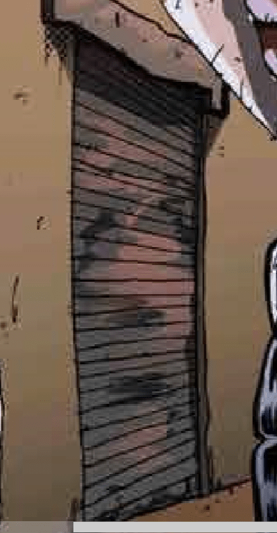
Are we hyping this up? No, we are just taking time to actually appreciate the work done here, because the goodies (and the devil…) is in the details. And we are judging based on that. Every artists has a style, but to put in this amount of detail, and be consistent about it? Wow. Look at the old door, you see it’s battered and bending in waves! Like THAT! THAT! OMG! The shadowing and light-schemes are impressive!
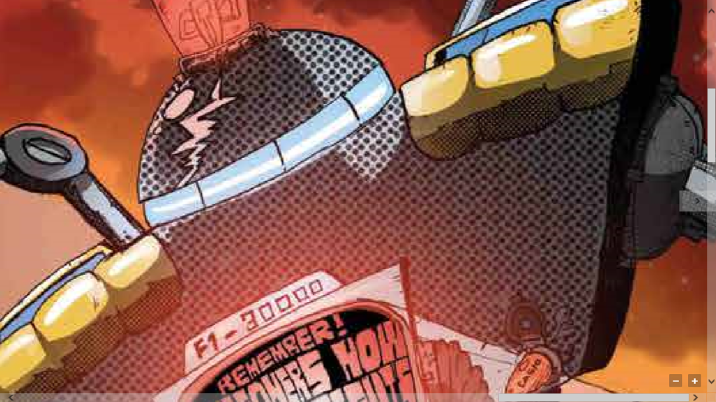
Still about the cover, because it’s that good, there’s the expected humour of the Complete Darkness series. Just look at the warning of the robot, ahhahhahahah. This is priceless right here. And then there’s the woman trying to hide her gun, lol!!!!!
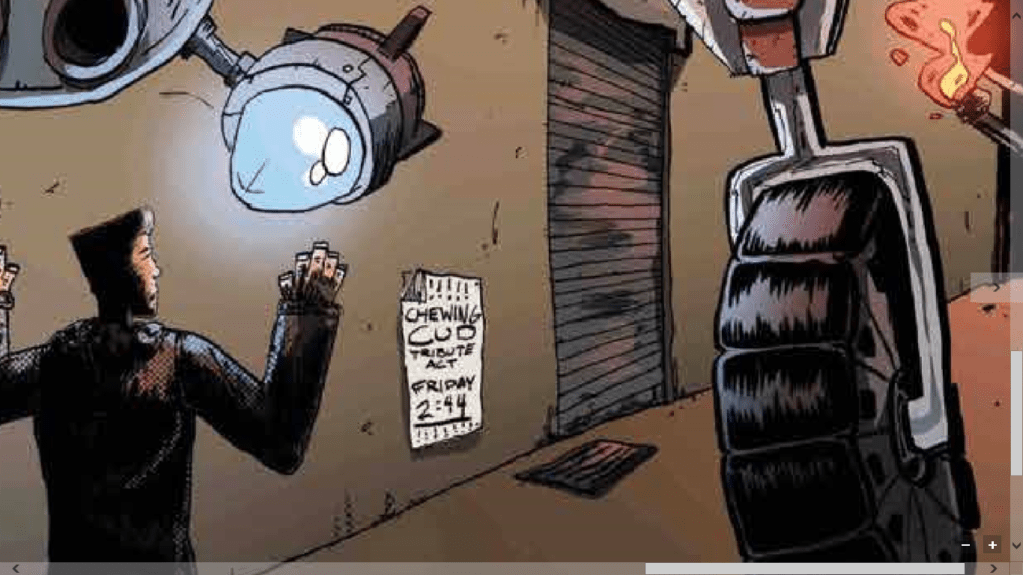
I want you all to check this region right here, the right middle part of the cover.

See how the light of the fire on the background creates a lighter tone on the wall, and then the screen of the robot that is illuminating our characters makes it get darker? If you zoom in you can see the way light waves are created by that, and each wave gradually grows to a lighter tone of the same colour. And then if you look closely, you can see that the light of the cannon of the robot creates another patch of light tones in that zone?! THAT my friends, THAT is paying attention to your job and being fucking good at it. Mad respect to Aline Martins for the colours here. Remarkable!!!!
This is mastery! There’s no other way to put it. This is being a pro at what you do, and if you still think we are hyping this up, look at the wheel of the robot’s wheel and tell us we are wrong.
Look at that light work and the representation of, texture, material reaction to the light and depth. Tell us we are seeing things, because, for us, in order for you to be good to a point where you even consider these things, and then have the skill to do it, and nail it this well… You can’t question that. You can’t question this amount of skill, it literally shows. Aline Martins NAILED IT, she absolutely nailed it!
A side-note, dear readers: Personally, while reading this comic and looking extensively at each frame, I was questioning myself if I would find a “flaw”, something that was overlooked. I’m still searching, and if you find something, please email your findings to Scribblesworthreviews at gmail. Lol.
We can talk about the shadowing for pages, because, for artists out there, you know how hard it’s to get shadowing right. Personally, I’m not an artist, but I’ve worked, and still work, with artists of all sorts, and I know how much they put their souls into things like these and it truly shows. I think we should only work with human artists when it comes to design, covers and comics, so if you can show your support for this amazing comic by getting one, or helping our on the crowd funding.
The artists made banger of a job in the textures! Not only on the lighting, but on the depth and the material that they were trying to present. Be it metal, glass or even cloth, you can see that they took detail on what was and how the light worked on it and were able to preserve the visual impression that those materials give, even in high intensity light, when they could’ve just “skipped” and “blamed it on the light”. Impressive!
Moving on to the comic content itself…
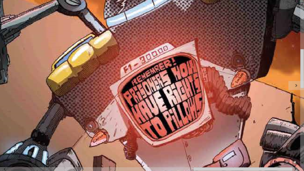
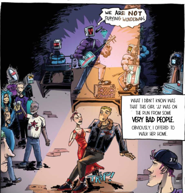
You still have that amazing lighting on the shots, with great shadowing, very consistent work presented. The humor is ever-present in the little details, like the HDMI-AV switch (and that other thing… lol), that once you think about it, you realize the joke of it. Remember, this is a cyberpunk comic, ahahahahahaha.
There are so many Easter eggs in this comic, like did I just read “Casio” on that robot? Hahahahaha,and this is why I’m a fan of the Complete Darkness comic series. It’s not that they are long, and ultra-mainstream and cute. No. They are rough, original and they have so many little details that they are a joy to explore and discover, and you have to pay attention to get these little things. It’s something you enjoy, and love having because they are so well made. This is unique right here, and for those who love collectibles, this is a comic that you should look at. There aren’t many works like this nowadays, that’s for sure, and there will be even fewer with the AI thing flooding the market. This is refreshing.

We get the story of an old man going about his recollections in youth, that he was the man without fear, talking to a robot that does not correlated emotionally with the story at all, but is there anyways, lol.
And I want to ask you this: How hard would it be, for you, to fall in love with a criminal? Hahahahhaa, no spoilers, but there are love-bombs andexplosions coming. Lol.
Of course, it’s a short comic, that brings readers in, makes them laugh a bit and doesn’t stray away from the “Complete Darkness” main comic. It’s, as said before, a side-comic. It opens up completely new possibilities when it comes to the Complete Darkness saga, so it’s a good add-on for new readers that know nothing about it, and want to know what the fuzz is all about.
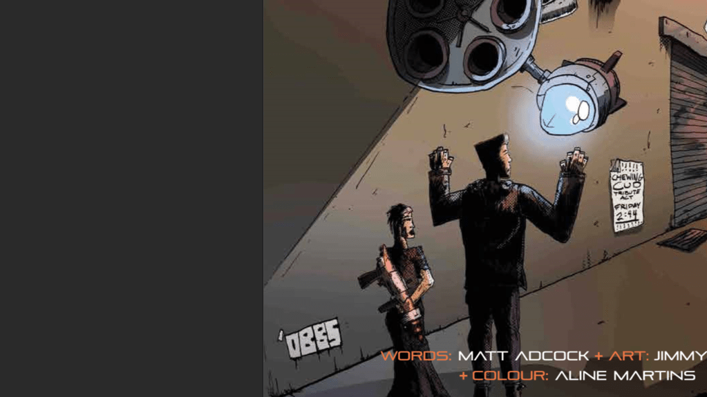
There’s a question that is running around my head as I read this gem: Is Jimmy Hobbs one of the artists featured in the Complete Darkness gift cards? We’ll get to know this on our next interview with the one and only, Matt Adcock in the next days. Grab your copies and enjoy!
- Excellent colour scheme
- Excellent lighting and shadowing
- The textures were brilliant at some points
- The 3D on 2D was noticeable
- The details were amazing
- Easter eggs
- Humour on the sotry tha makes you chill
- A plot that doesn’t deviate from the main story
Cons:
- Haven’t foudn it yet

Leave a comment