
The awaited second issue of the incredible, award winning book & comic, Complete Darkness, from the perfect duo. Matt Adcock and Karl Brown is finally here on our review shores and the first impression we have of it is that, the graphics are calibrated. Yes, calibrated, because you cannot make the contours of that soldier right arm shine through the cape of the main character without some serious calibration of stroke.

Just to remind you guys that this comic is hand-made, HAND-made, and this can take months to accomplish, so hands down, once again to Karl Brown for this!
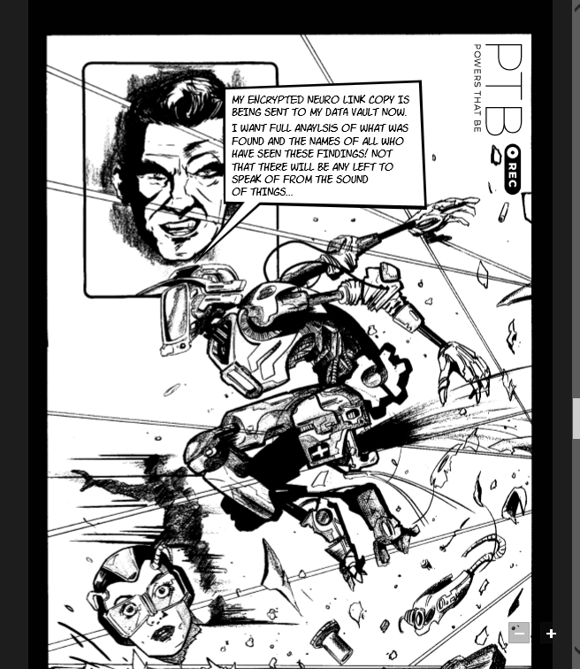
Another, detail that you will want to double-check, are the cables of the same soldier, on his legs, and thigh region. Why? Take a moment and count how many cables are there and how many criss-cross sections each has. Take a moment to admire the amount of dedication it took to do THAT!. I’m impressed. If I was at a comic convention and I saw what I’m seeing now, then heck, I would have bought it, because of the amount of work put into making that soldier! Never mind on how smooth the cape is. Don’t mind that. I know it’s black, but, once again, this is handmade, so yeah, you should take this into account! There are NO FLAWS there! No waves, no spots left unpainted, the corners are respected and there is THAT light on the soldier’s arm that makes the boundaries of sections, like bringing the soldier forwards. This is excellent! I know I may be geeking out of this, and may be sounding ridiculous, but remember, I already know the story and I LOVE IT, (and can’t wait for the second book to come, thank you Matt), so I’m here for Karl’s artwork, hahahahahahaha, sorry Matt, ahahhahaha.

Ok, on page 3, we have a brief explanation on what the comic is about, and a reference to the main book, which you can read here, we reviewed it (and it got an award…), and there is a line of dancing surprises that you will laugh when you see it-.
A kind of “upgrade” that we have in terms of graphics, is that it seems that Karl gave a more 3D style than the last comic and it has more “colours”, added through the pc afterwards, (You’ll understand why I am saying this when you read it ) , and there is also more depth to the characters features, both in terms of facial expression, anatomy and clothing, that has taken out that clean-cut aspect, but added more feel and emotion to the whole comic. And here’s why I say this: Imagine you having a black and white comic; how boring would it be if it was completely plain and depthless? That’s the point.
I like this last aspect a lot, because it also helps show the conditions of the citizens of L2, because, if you remember well in the book, things, weren’t great many of the times, so this aspect added a few points to the comic. Well done Karl!
Ok. Let me tell you this, although I already knew the story, heck, I’ve read it like 3 times now, the graphics made the whole difference. It felt like I was reading these sequences for the first time, and many times I had to stop and literally look around the frame to be able to get a better picture of the story and let me tell you that the graphics delivered. If you read the book, and follow through the comic you will see that they are parallel to each other, except that the comic actually draws how you would feel and imagine reading it. Man! Karl made a great job here. Yes, yes, of course, the graphics took a different approach this time compared to the last comic, sure, I agree, but damn this feel more real and raw.
I can’t wait for the third edition of the comic to come out and show the action scenes of the book, and if Karl keeps up with this mixture of colour at random, and the day when the dark forces come gets a coloured page, oh man that will be so sweet!!! This comic series is getting better and better the more editions it has, and one day when all the 1st part of the comic is finished, along with the book, that will be perfect!
Yes, yes, yes, I’m telling you to buy this comic, because it’s eye candy! Like, ok, you will see ads, and that part was clever from Matt, (and maybe diversifying the ads would help), but this is artwork and author work worth having. GREAT read, and this is a comic that you will want to repeat read. Great work from Matt, EXCELLENT work from Karl, this amazing duo and yeah, do get your copy on the links below.
Pros:
- Excellent artwork with an innovative and deeper approach
- Consistency of graphics
- Nice colour when it had colours other than black and white
- The story and the graphics were kept true to the novel
- The details in the characters expression were very well represented
Cons:
- The cyber ads could be more varied
